Set the Properties
Create a new form by clicking the 'Create new form' button. You'll be asked to enter a name.
Create the content of a form
The form builder will then open, allowing you to configure the form's elements and appearance.
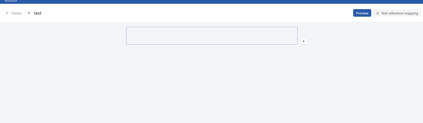
The form builder
Element types
Line
A line is a separator that allows you to organize the form and break it down into logical sections for the user.
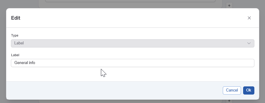
Label
A label is a line of text that allows you to organize the form and provide context to the user. When adding a Label, you'll be asked to enter the label text:
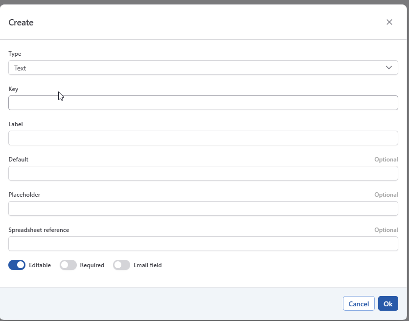
Text
This allows you to configure a text field.
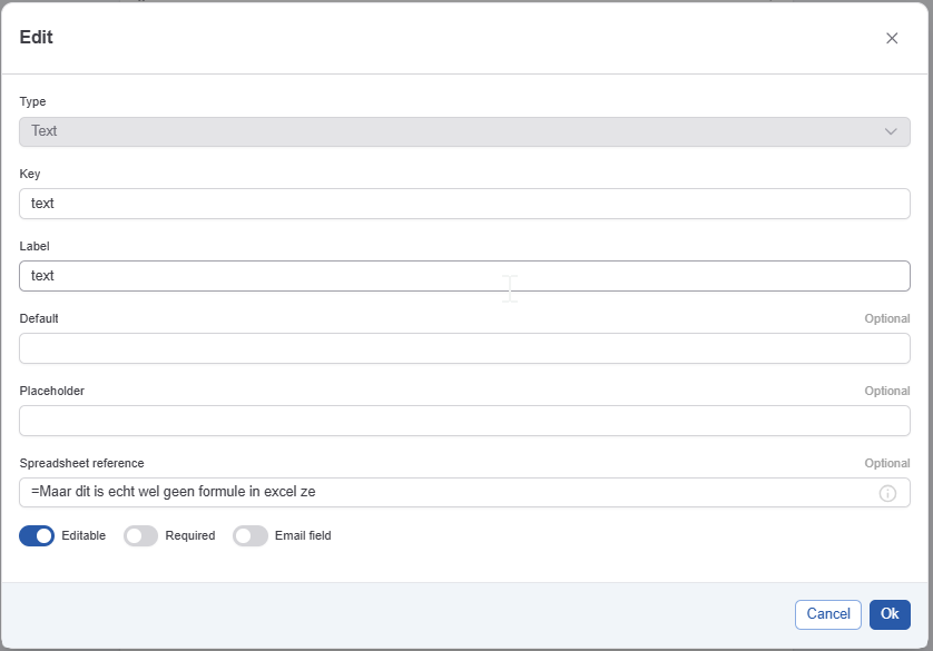
The text configuration has the following elements:
-
The key (see Data & Form Concepts for more info) - required
-
The label users see when completing the form - required
-
A default value that will be proposed to the user - optional
-
A placeholder. A placeholder can be used to provide additional guidance to a user - optional
-
Spreadsheet reference: Used for reading values from an excel sheet. See How-to: Automatically Fill in Form for more details.
The text configuration has the following configurable properties:
-
Editable. This allows you to show a value, for example from a previously filled in form, whiteout allowing the user to modify it. See Data & Form Concepts for more info.
-
Required. If active the user is obliged to enter a value.
-
Email field: If this field is selected this field will act as an email field:
-
When a value is entered, the system will check if it is a valid email address.
-
The field can used to specify the receiver in the notification tab of the task configuration. See Configuring forms for automatic completion for more details.
-
-
URL field: If this field is selected the field will act as a URL field:
-
When a value is entered, the system will check if it is a valid URL.
-
The field can be used as the source for a reference link on an approval task, via a smartname. See Approve asset(s) for more details.
-
Text area
The text area element allows an actor to enter a text block and format that text (bold, italic,…)
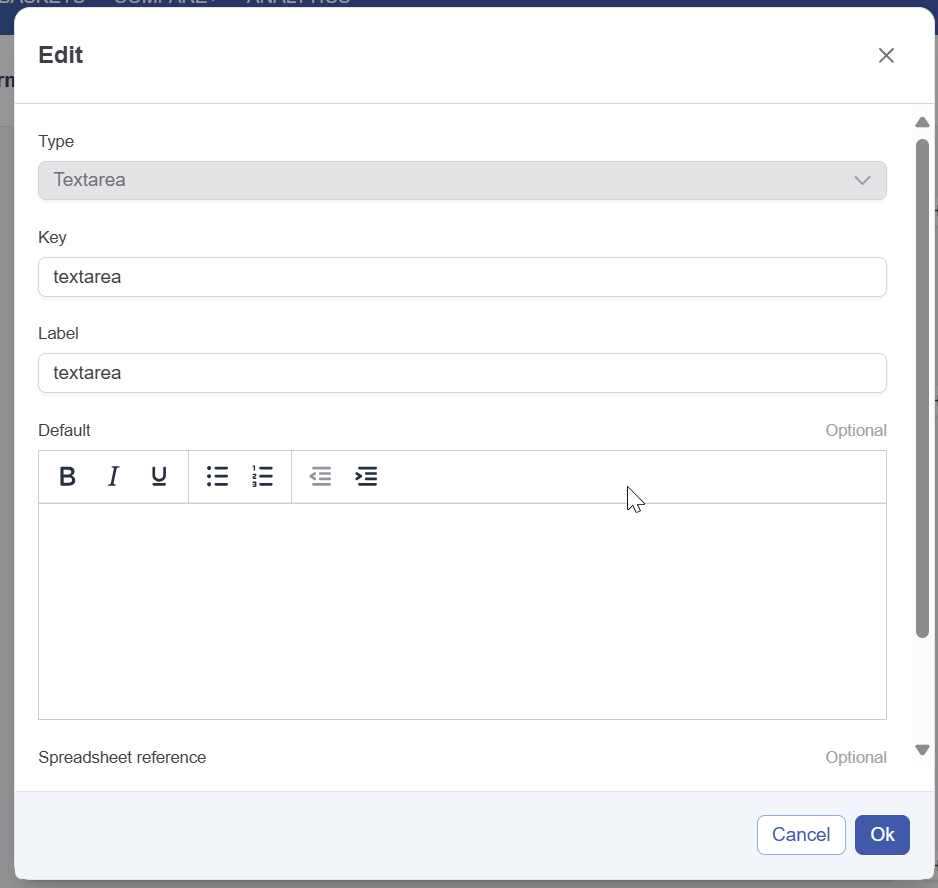
The text area configuration has the following elements:
-
The key (see Data & Form Concepts for more info) - required
-
The label users see when completing the form - required
-
A default value that will be proposed to the user - optional
-
Spreadsheet reference: Used for reading values from an excel sheet. See How-to: Automatically Fill in Form for more details. - optional
The text area configuration has the following configurable properties:
-
Editable. This allows you to show a value, for example from a previously filled in form, whiteout allowing the user to modify it. See Data & Form Concepts for more info.
-
Required. If active the user is obliged to enter a value.
Number
This allows you to configure a number field.
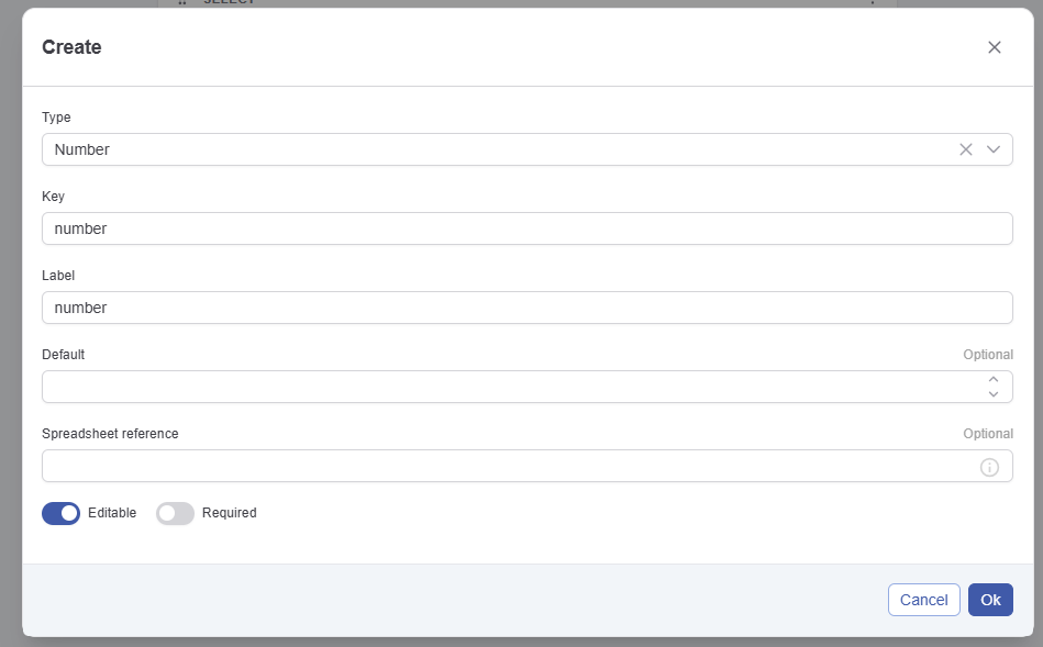
The number configuration has the following elements:
-
The key (see Data & Form Concepts for more info) - required
-
The label users see when completing the form - required
-
A default value that will be proposed to the user - optional
-
A placeholder. A placeholder can be used to provide additional guidance to a user - optional
-
Spreadsheet reference: Used for reading values from an excel sheet. See How-to: Automatically Fill in Form for more details.
The text configuration has the following configurable properties:
-
Editable. This allows you to show a value, for example from a previously filled in form, whiteout allowing the user to modify it. See Data & Form Concepts for more info.
-
Required. If active the user is obliged to enter a value.
Date
The date element allows an actor to enter a date
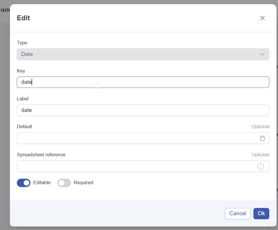
The date configuration has the following elements:
-
The key (see Data & Form Concepts for more info) - required
-
The label users see when completing the form - required
-
A default value that will be proposed to the user - optional
-
Spreadsheet reference: Used for reading values from an excel sheet. See How-to: Automatically Fill in Form for more details. - optional
The date configuration has the following configurable properties:
-
Editable. This allows you to show a value, for example from a previously filled in form, whiteout allowing the user to modify it. See Data & Form Concepts for more info.
-
Required. If active the user is obliged to enter a value.
Checkbox/multiselect
The checkbox and multi select elements allows an actor to select multiple values from a list.
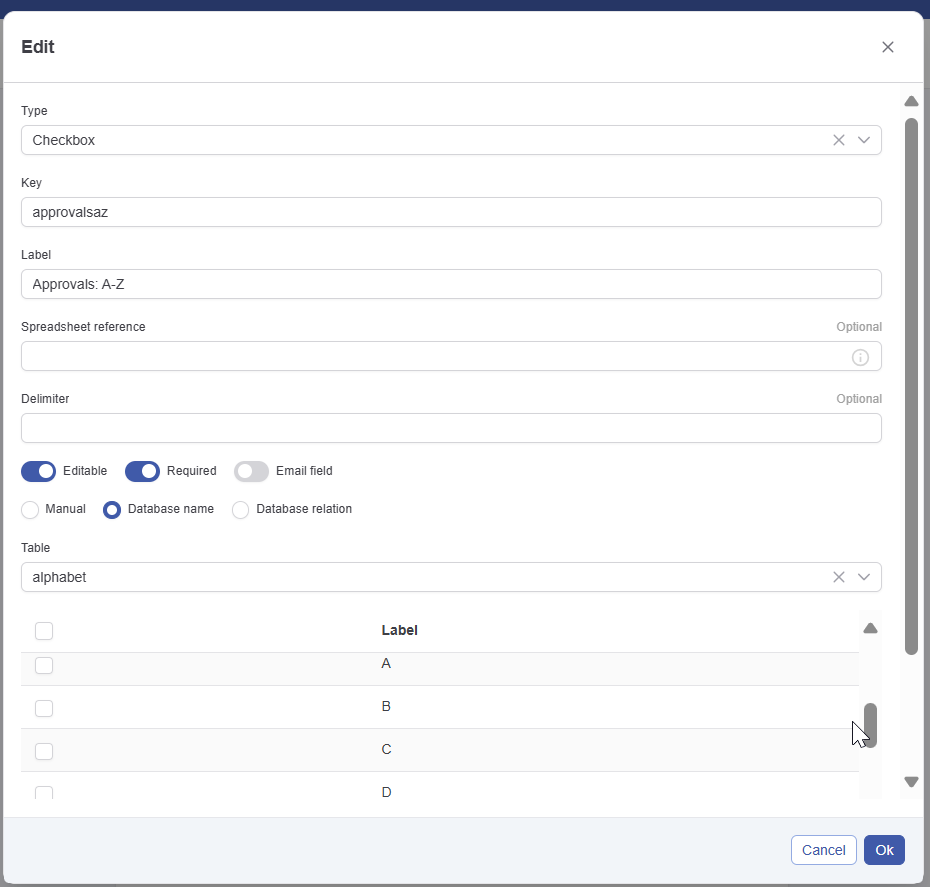
The checkbox configuration has the following elements:
-
The type determines how the list appears to the user when completing the form.
-
Checkbox shows a list of possible values and allows multiple selections.
-
Select (multi) shows a dropdown and allows multiple selections.
You can change the presentation at any time.
-
-
The key (see Data & Form Concepts for more info) - required
-
The label users see when completing the form - required
-
Spreadsheet reference: Used for reading values from an excel sheet. See How-to: Automatically Fill in Form for more details. - optional
-
Delimiter: The delimter to use when when reading the value(s) from a spreadsheet.
The checkbox configuration has the following configurable properties:
-
Editable. This allows you to show a value, for example from a previously filled in form, whiteout allowing the user to modify it. See Data & Form Concepts for more info.
-
Required. If active the user is obliged to enter a value.
-
Email field: If this field is selected the field can used to specify the receiver in the notification tab of the task configuration. See Configuring forms for automatic completion for more details. It is your responsibility to make sure the values (either filled in manual, via database or via relation are valid email addresses).
The checkbox/multiselect configuration can get it's values from 3 sources. See How to assign values to checkbox/multiselect/radio/select for information on this.
Radio button/Select
The select/Radio button element allows an actor to select a single value from a list
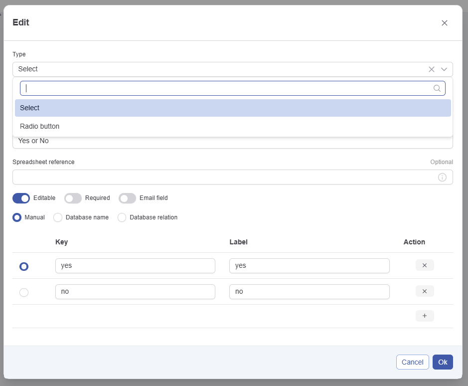
The select configuration has the following elements:
-
The type determines how the list appears to the user when completing the form.
-
Radio button shows a list of possible values and allows single selections.
-
Select shows a dropdown and allows a single selections.
You can change the presentation at any time.
-
-
The key (see Data & Form Concepts for more info) - required
-
The label in the different languages- required
-
Spreadsheet reference: Used for reading values from an excel sheet. See How-to: Automatically Fill in Form for more details. - optional
The select configuration has the following configurable properties:
-
Editable. This allows you to show a value, for example from a previously filled in form, whiteout allowing the user to modify it. See Data & Form Concepts for more info.
-
Required. If active the user is obliged to enter a value.
-
Email field: If this field is selected the field can used to specify the receiver in the notification tab of the task configuration. See Configuring forms for automatic completion for more details. It is your responsibility to make sure the values (either filled in manual, via database or via relation are valid email addresses).
The radiobutton/select configuration can get it's values from 3 sources. See How to assign values to checkbox/multiselect/radio/select for information on this.