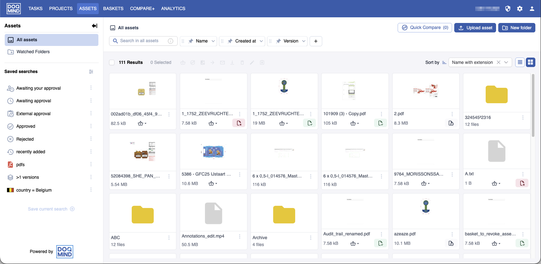
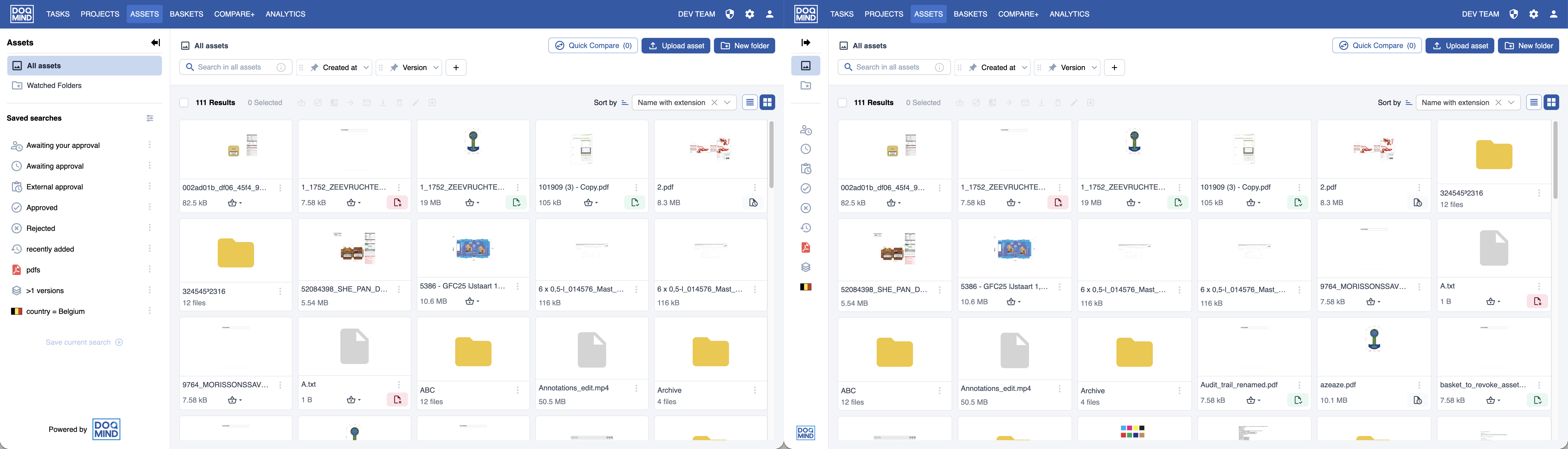
The header
The header consists of 2 rows.
The top row contains
-
a breadcrumb of the current location within the module.
-
the primary actions
-
searching and filtering
The bottom row gives:
-
Bulk action controls, which allow you to manipulate multiple assets in a single action
-
A checkbox to select all elements in view
-
The amount of elements in view
-
The amount of elements currently selected
-
-
View controls: sorting and selecting columns in list view.
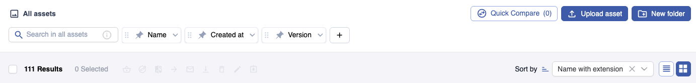
Search
The search input field allows you to search through the elements of the module.
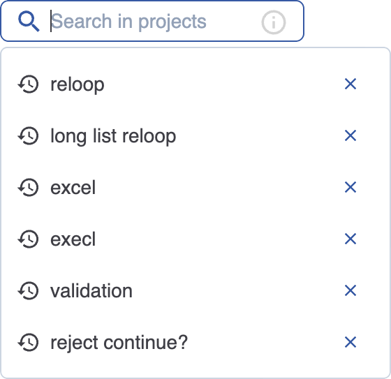
When placing the cursor in the quick search bar, a dropdown appears that shows your recent searches.
Wildcards
It is possible to incorporate wildcards in your search criterium to make it more flexible.
|
Wildcard |
Description |
Example |
|---|---|---|
|
* |
Matches any number of characters. You can use the asterisk (*) anywhere in a character string. |
wh* finds what, white, and why, but not awhile or watch. |
|
? |
Matches a single alphabet in a specific position. |
b?ll finds ball, bell, and bill. |
Filtering
Along with the quick search, you can also display and enable different filters. Every user can select the fields, metadata and properties they find most relevant and add them to their top bar. Upon adding a new filter, the filter can be configured and pinned.
Each filter configuration consists of 3 elements: property, operator and value.
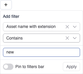
The example of a new filter in the screenshot above has the following elements:
-
Property: “Asset name with extension”
-
Operator: “Contains”
-
Value: “new”
Also, the toggle to pin the filter is disabled.
Property
The list of properties that can be filtered on consists of the system fields and the metadata. Every module has its own applicable properties.
Operator
Every property has a type. Based on this type, the set of applicable operators are available. For example: only date properties, such as “Created at” in the Assets module, will have the operator “after”
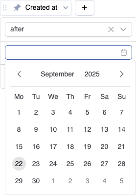
Value
Also dependant on the type of the property, a value can be entered. In the previous example, where a date property is being configured, the value can only be chosen from date picker.
Pinning
When pinning a filter, it will remain in the topbar, even if the filtering is reset. This allows the user to have quick access to properties frequently filtered on. Pinning can be done directly from the filter, or from the expanded configuration dropdown. Careful, unpinning an inactive filter will immediately remove it from the topbar.
Overview
While browsing a module a user can easily see if filters are active, and if that is the case, which are active. It is also easy to disable filtering by clicking “Reset”
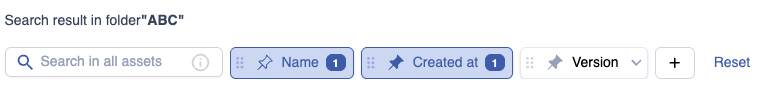
In this example, there are 3 filters visible:
-
The filter on the field “Name” is active and unpinned, it has 1 value it is being filtered on.
-
The filter on the field “Created at” is active and pinned, it has 1 value it is being filtered on.
-
The filter on the field “Version” is inactive and pinned.
When we click reset, all filtering will be removed and the unpinned filter “Name” will be removed from the top bar.
The sidebar
The sidebar can expanded and collapsed. When collapsed, the elements in the sidebar can be identified by an icon.
Saved searches
There are three types of searches:
-
System searches – These are built in and cannot be edited or deleted. You can only change their visibility and order.
-
Shared searches – These are created and managed by administrators.
-
Saved searches - These are created and managed by users. When saving a search, the current set of active filters is saved for easy reuse.
System searches and shared searches can’t be modified or deleted. By pressing the pencil icon in the sidebar you can switch their visibility and change their order.
For sorting your searches you can add a divider by hovering in between the searches and press the ‘+’.
Saved searches are user defined. When saving a search, the current set of active filters is saved for easy reuse.
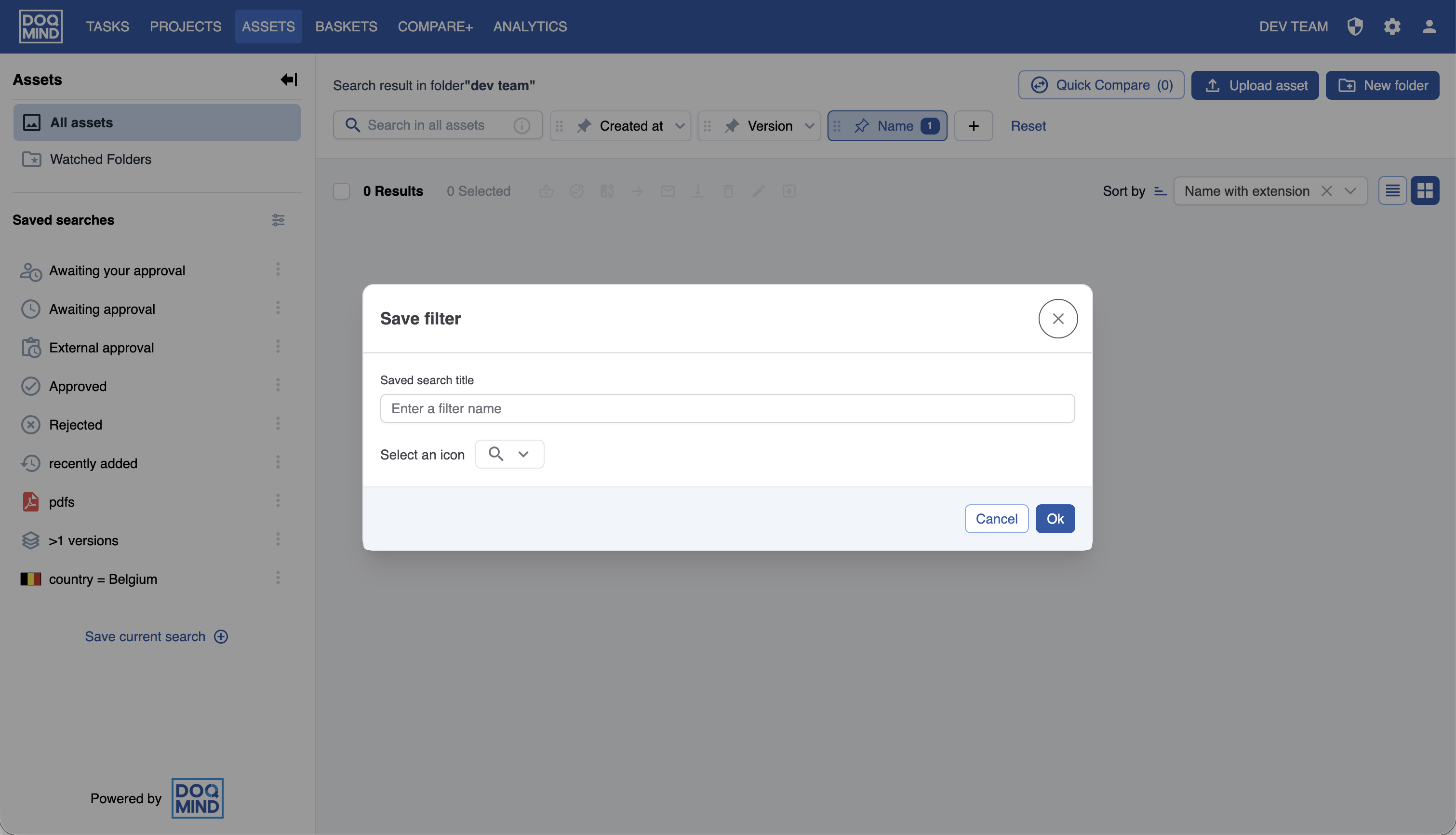
An icon can be selected to show the filter when the sidebar is collapsed.
An existing saved search can be edited.
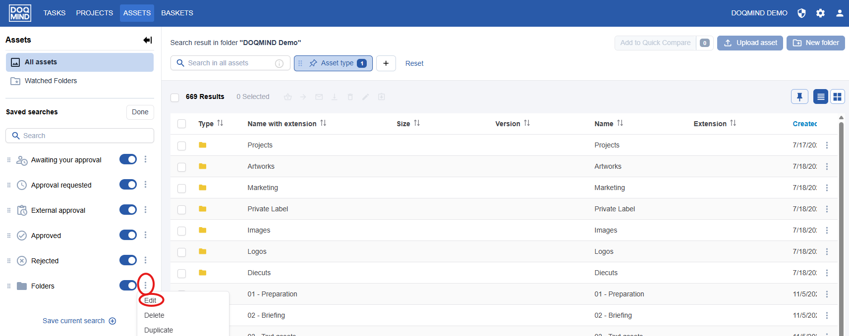
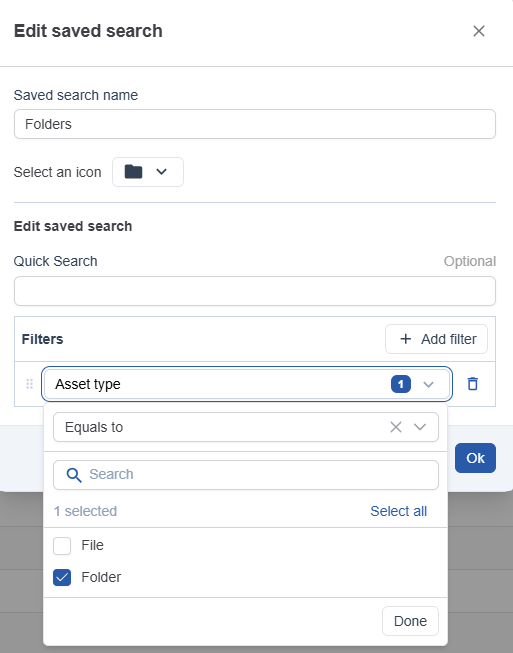
The following can be changed:
-
Title
-
Icon
-
Quick Search
-
Quick filters
In the quick filters, you can add, remove or edit filter. You can also change the order by dragging the filters to other positions in the list.
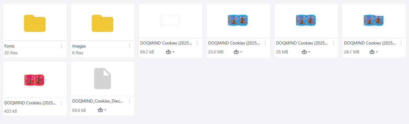
The content
Here you can see the elements in the module.
Clicking an element will perform different actions, dependant on the type of element. In Assets, clicking a folder will navigate to this folder and show its contents. In Tasks, clicking a task will show the task execution modal, In Projects, clicking a project will show the project details page. In every module, clicking a PDF asset will open the viewer.
The content can be shown in a grid view, or in a list view. The list view allows you to specify which columns you want to see in which order, as described in the Working with list view chapter.